Usability on a Budget
Of course, with library budgets bursting at the seams, nobody has to worry about attracting patrons or customer service, right? No need to worry about your website as long as you just have one, right? (Cue buzzer sound!) Unfortunately, some librarians seem to think that merely having a web presence is enough, as if going live is all that needs to be done. They don’t consider the wider issues that differentiate a strong web presence from mere presence. One of the most important of these issues is establishing whether a website is usable…from the patron’s perspective. Kim Guenther points out, in her column “Assessing Web Site Usability,” that a site that fails to “effectively serve the needs of its intended audience will result in decreased traffic and has little chance of cultivating repeat visitors” and can create a “backlash [that] could extend beyond the virtual visit to the…brick-and-mortar equivalent.”[1]
A good website has cool features, right? Buzz again! Andrew K. Pace points out that there is nothing wrong with a “cool Web site,” but reminds us that “‘cool’ should not be used synonymously with ‘good.’”[2]
Of course, in a belt-cinching economy, most libraries cannot afford elaborate usability testing…and it can get expensive. However, it is an important enough concept that it cannot be skipped or skimped. A number of writers do seem to agree that good, useful usability testing can be done without smashing the pig.
One of the first important concepts of usability testing is to keep the big questions in mind. Danielle Becker points out two of these. First, she reminds us, “Usability testing is a way to observe users interacting with your website. Are they finding what they want whenthey want it?”[3] Again, usability is all about users, not us. Second, she tells us, “Usability testing is a tool to discover if users are using the site as it was intended. Are they interacting with the site in ways the design team didn’t anticipate?”[4] Knowing that our users may not be using the site the way we thought they would can be extraordinarily valuable information. If we can find this out early on, then we have the ability to rework the website to fit their needs and expectations.
Becker’s concise article offers a wealth of important suggestions and questions to consider. She proceeds from the perspective of “budget-challenged” libraries[5] and suggests ways usability can be tested without having to contract it out to specialty firms, rent testing space, or splurge for expensive equipment.
One important point that Becker makes is that testing is most effective when conducted in multiple sessions with fewer participants—“Popular opinion these days suggests that testing five users per session is plenty.”[6] She also recommends giving testers the “chance to give their opinions and state their preferences.”[7] Again, keep in mind that we need to design the website for users and not for ourselves. She ends with a series of valuable questions that can also help at the front end in the design and building phase:
- “Are your color choices and images adding or distracting to your users?”
- “Are your users getting information quickly?”
- “Are your users spending too much time reading before they get to the main points?” [This, of course, refers to any text we put on our pages.]
- “Is your website content fresh?” [Here, she notes that usability is actually a long-term process and that we should constantly invite feedback from our users.]
- “Is your content crowded?” [8]
Another important step in determining usability is to learn what other organizations have learned. If we do this, then we can probably initially design websites that do not need too much tweaking later on. Greg Byerly, in an article on usability testing with children, notes some good general principles that can help all of us with website creation…and re-creation when it is necessary.
First, be aware of the “golden triangle.”[9] This refers to the upper left-hand part of the screen:
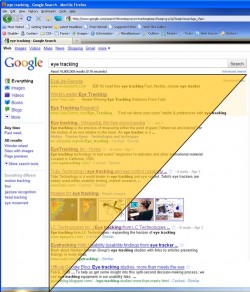
Research indicates that users’ eyes wander to this part of the screen more often and for longer periods of time.[10] Another point is that “ease of use beats interactive glitz.”[11] All things being equal, the more bells and whistles a website has, the greater the potential to frustrate the user. Another important point is to use terminology users know.[12] Most users will respond better to “Checkout Policies” than to “Circulation Policies.”
The upshot is that good usability testing is not a “nice to do” activity, but a necessary one in today’s information environment. It can also go a long way in encouraging loyalty among patrons as well as become a valuable way to get to know and serve our communities better.
[1] Guenther, Kim. “Assessing Web Site Usability.” Online, March/April 2003, 65-68. p. 65
[2] Pace, Andrew K. “The Usability Toolbox.” Computers in Libraries, Jan. 2003, 50-52. p. 52
[3] Becker, Danielle. “Test-Driving Your Website.” Online, May/June 2011, 38-41. p. 39 ; italics added
[4] Becker, p. 39; italics added
[5] Becker, p. 38
[6] Becker, p. 39
[7] Becker, p. 41
[8] Becker, p. 41
[9] Byerly, Greg. “Look in Their Eyes: Eye Tracking, Usability, and Children.” School Library Media Activities Monthly, April 2007, 30-32. p. 31
[10] To see a screen capture of eye-tracking software that confirms the golden triangle’s existence, see usablitygeek.com’s introduction usability testing.
[11] Byerly, p. 32.
[12] Byerly, p. 32.
Tags: website usability