User Experience: Start Small, Think Big
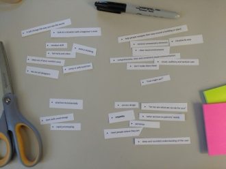
At the beginning of this series, I had an ambitious goal: “to demystify the concepts of user experience, design thinking, and human centered design for public librarians.” In order to pull the concepts together, I did a quick design thinking exercise: I printed out key phrases from each post, cut them into strips of paper, and sorted them into threads or themes.
A new way of thinking
This way of working is not easy for many people. It requires, for most of us, a major mindset shift where we embrace uncertainty, look at situations with a beginner’s mind, and fail often. We are all designers, whether we know it or not, and we can step out of our comfort zones to make our libraries better.
Start small
Simple incremental steps go a long way to effect change. Start with a new voicemail message or venture out from behind the desk to help patrons on the floor. Try something new. If it doesn’t work, try something else. There are no mistakes!
Make things intuitive and easy
Steve Krug’s book Don’t Make Me Think is all about thinking this way in the digital world. It’s just as valid in physical environments—how many times have you seen someone walk in the library entrance, stop and look around with that lost look on their face? Think about ways to help people navigate their world. Remove clutter and work toward providing clear and consistent visual, auditory, and tactile cues.
Empathy
Meet people where they are, not where you think they should be. Tear down the Wall of No and listen to what people really need. Librarians are great at the reference interview—shift that technique a bit and use it in every single interaction. It doesn’t have to be perfect or long. Tweak your approach to accommodate the person in front of you. They’ll appreciate the personal service.
Breaking down traditional ways of operating, with huge policy manuals and complicated procedures, only serves to reinforce the old-fashioned stereotype of librarians in buns. I’m not advocating anarchy, but we have to understand that libraries are no longer the only game in town. We are competing with Starbucks, Amazon, and Google, and we have to make our libraries comfortable and responsive—places where people want to go and spend time. Start small, but think big.
Here are links to three LibGuides with lots of resources to continue learning:
Elements of UX: A Librarian’s Guide to User Experience Design
Meeting People Where They Are: an Introduction to Service Design in Libraries
Check out the rest of the series below.
Improving Your Library’s UX
Improving your Library’s UX: Go On a Service Safari
Enhance Library User Experience with ‘Design Thinking’
Rethinking User Experience Touchpoints
Identifying Your Library’s Users
A Look at Basic Service Design
Finding Your Way with Wayfinding
Tags: change at the library, empathy, library ux, user experience, ux


